
Please Choose Your Language


Views: 0 Author: Site Editor Publish Time: 2026-07-10 Origin: Site


Choosing a fence color is rarely as simple as matching a brown or gray sample to a building photo. A WPC Fence can look balanced in a small swatch yet feel too dark, too busy, or disconnected once it runs across a villa courtyard or park boundary. Surface texture, post color, paving, planting, viewing distance, and changing daylight all affect the final impression. A practical selection process should compare the fence with permanent site materials, define the right level of contrast, and verify several boards under real outdoor light before the order is approved.
A villa fence is usually observed from windows, entrance paths, patios, balconies, garden seating, and other short viewing distances. At that range, people notice more than the general color family. Grain depth, surface relief, board-to-board variation, trims, posts, caps, and gate details all contribute to the finished composition. A WPC fence that appears calm from the street may look much more active when viewed every day from a dining terrace only a few meters away.
The first decision should therefore concern the visual role of the boundary. Some villa courtyards need fencing that recedes behind trees, shrubs, and outdoor furniture, while others need a stronger architectural plane that extends the colors of the building into the garden. In smaller spaces, a tall, dark, highly textured fence can feel heavier than the same product installed around a larger property. A lighter or quieter finish may preserve privacy without making the courtyard appear boxed in.
Close-range coordination also requires attention to adjacent materials. A warm wood-grain finish may work beside cream render and earthy stone, yet look disconnected beside cool concrete and blue-gray metalwork. Matching does not require an exact copy of the façade; repeating an undertone or connecting two existing materials is often more convincing. The fence should support the villa exterior rather than compete with every wall, roof edge, planter, and paving surface.
Public parks are read differently because visitors see boundaries from entrances, roads, lawns, paths, play areas, pools, and constantly changing angles. Long runs create repetition, so small differences between panels may combine into a strong visual effect. Fine wood grain can disappear at distance, while bold tonal movement, bright frames, or strongly contrasting posts remain visible across an entire landscape zone. For that reason, park landscape decisions should prioritize consistency and rhythm before close-up decorative detail.
A park fence may also need to coordinate with several environments instead of one building. One section could pass beside dense planting, another along pale paving, and another near shelters, signs, benches, or service areas. A restrained mid-tone can often move between these conditions more easily than an extreme light or dark finish. Where greater contrast is needed for entrances or wayfinding, it is usually more effective to concentrate it at selected points rather than repeat it at every post.
Villa projects therefore tend to emphasize intimacy, material detail, and the daily view from nearby rooms. Park projects require visual order across distance, repeated modules, and compatibility with changing surroundings. Recognizing that difference prevents the same fence color palette from being applied to two very different design problems.
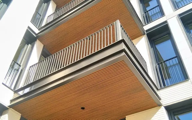
Color selection should begin with elements that are difficult or expensive to replace. Exterior walls, roof materials, brickwork, window frames, doors, stone bases, retaining walls, and permanent paving form the fixed palette around which the WPC fence must work. Plants and furniture can change over time, but these architectural surfaces will continue to influence the boundary for many years.
There are three practical ways to relate the fence to the building. The panels can repeat an undertone already present in the façade, bridge two different materials, or create a deliberate but controlled contrast. For example, a medium warm-neutral finish may connect pale render with brown-gray stone without copying either one exactly. On a modern villa with cool concrete and dark glazing frames, a muted cool-neutral panel with darker posts may create continuity without turning the entire boundary into a black wall.
Paving covers a large horizontal area and often reflects light onto the vertical fence surface. Instead of matching the dominant paving color exactly, look for a secondary undertone that can be repeated in the panels or posts. This creates a connection without producing an overly uniform scheme. Where stone or tile already contains pronounced variation, a quieter WPC fence can prevent the space from becoming visually crowded.
Vegetation changes how color is perceived throughout the year. Deep panels may recede behind bright green foliage, but the same finish can feel heavy in a narrow, shaded garden. Pale fencing may separate clearly from dark shrubs while becoming more prominent when winter planting loses density. Flowering landscapes usually benefit from a relatively restrained background so seasonal color remains the focal point.
Lightness, color temperature, texture, and installation area must be judged together. Darker surfaces often make a boundary more definite, but they can also make high fencing feel closer. Lighter panels may reduce visual weight, although they can stand out strongly against shaded plants or dark masonry. Warm and cool tones influence coordination, but neither automatically determines whether a design feels traditional or modern.
Texture can change the apparent depth of the same color. Deep wood-grain grooves create small shadows that may make a mid-tone surface appear richer and darker. A stone-pattern surface introduces broader tonal movement, so it should be checked against masonry and patterned paving to avoid competing textures. Color perception is also affected by gloss, surface relief, illumination, and viewing angle.
Project Setting | Suitable Color Direction | Elements to Coordinate | Visual Risk to Avoid |
Traditional villa | Warm-neutral or natural-material direction adjusted to existing undertones | Roof, brickwork, entrance door, stone base, garden structures | A strongly red or highly varied surface competing with masonry |
Modern villa | Restrained warm or cool neutral with carefully controlled contrast | Render, concrete, glazing frames, metal details, paving | Assuming the darkest finish is automatically the most modern |
Landscape garden | Quiet background tone or a material-inspired finish | Planting, paths, pergolas, retaining walls, furniture | Grain or pattern competing with flowers and foliage |
Public park | Consistent mid-light or mid-dark palette suitable for repetition | Paths, signs, benches, shelters, landscape zones | Strong post contrast fragmenting a long fence line |
Poolside or paved area | Tone selected after testing glare, reflection, and paving brightness | Pool coping, paving, walls, furniture, safety elements | Approving the finish indoors without checking direct sunlight |
Fence color should be planned as a complete system rather than as a panel-only decision. Infill boards, posts, rails, edge frames, gates, post caps, and visible hardware create a single elevation. Even when the panels occupy most of the area, narrow framing components can strongly influence rhythm because they repeat along the full boundary. A successful WPC fence composition decides in advance which elements should blend and which should remain visible.
A unified palette keeps panels and framing close in tone. This approach works well in compact villa courtyards, gardens containing several other materials, and long boundaries intended to recede behind planting. Small variations between panels can still provide depth, but the structure does not break into sharply defined bays. The result is generally calmer, particularly when the fence is viewed from nearby windows or seating areas.
Framed contrast uses posts and borders that are noticeably lighter or darker than the infill. It can connect a WPC fence with window frames, metal pergolas, gates, lighting fixtures, or other architectural lines. In parks, controlled post-and-panel contrast may help organize a long boundary and establish a repeated module. Excessive contrast at every post, however, can divide the elevation into many narrow sections and make the fence appear busier than intended.
Selective accent offers a middle approach. Most panels and structural parts remain restrained, while gates, entrance bays, or important transitions receive stronger contrast. This helps identify access points without turning every component into a focal feature. A gate can match the panels for continuity or match the frame for emphasis, but an unrelated third color should only be introduced when it already appears elsewhere in the project.
A wood-grain finish can connect fencing with pergolas, doors, decking, or outdoor furniture, but exact imitation is rarely necessary. Coordination is more reliable when the materials share a compatible undertone and similar visual intensity. If the decking already has strong multi-tonal grain, a quieter fence surface may provide balance. Where the architecture is simple, slightly deeper embossing can add interest without requiring another color.
Stone-pattern surfaces follow the same principle. They can relate a boundary to columns, retaining walls, masonry, or paving, particularly where a plain wood look would feel disconnected from the landscape. EcoTechWood stone-pattern co-extrusion boards can be incorporated into garden and villa fence designs where textured material coordination is required.
Neither stone pattern nor wood grain is inherently more premium. The better choice depends on architectural context, viewing distance, fence dimensions, and the complexity of nearby materials. A richly varied sample may look impressive when held alone, yet become restless after the pattern is repeated over thirty or forty panels. Conversely, a subtle surface that seems plain in the showroom may gain sufficient depth from sunlight, joints, posts, planting shadows, and changes in viewing angle.
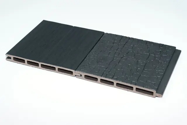
Request a sample large enough to show the base color, grain or stone-pattern variation, surface reflectivity, edges, and relationship with the proposed frame. Small chips may hide the frequency of repeated patterns or the size of tonal streaks. The board should be positioned vertically because a horizontal sample receives light differently from an installed fence. Posts, rails, caps, and gate materials should be placed beside it at the same time.
Testing should cover morning sun, midday brightness, afternoon light, full shade, and overcast conditions. Place the sample against the actual villa exterior or within the park landscape, close to the paving, stone, planting, and metalwork it must coordinate with. Where evening use matters, review it under the planned outdoor lighting as well. The goal is not to find one condition in which the finish looks attractive, but to confirm that it remains acceptable as light and surroundings change.
Scale must also be simulated before ordering. A rendering can show the broad color relationship, while a repeated board arrangement reveals pattern density. For larger villas, park boundaries, entrances, or pool enclosures, a short trial bay containing panels, posts, trims, and hardware gives the clearest result. Review it from close range and from the distance at which most users will see it.
Production control is part of color approval, especially for phased or high-volume projects. Record the approved physical sample, finish code, acceptable variation, production batch, and component colors. Confirm whether panels for one visible fence run can be supplied from the same batch and retain spare boards where later replacement may be difficult. Batch consistency does not mean every textured panel must appear identical, but the permitted range should be understood before installation.
Successful WPC Fence color matching starts with the setting, not a catalog name. Villa projects usually need close-range harmony with façades, paving, and planting, while park boundaries require stronger control of repetition, viewing distance, and visual weight. After selecting a main color direction, compare panels, posts, gates, and surface textures as one system, then confirm the result under real daylight with multiple sample boards.
Zhejiang Kunhong New Material Co., Ltd. provides WPC fence finishes and project sampling support that can help buyers compare color, texture, and batch consistency before ordering, reducing mismatches across large installations.


